.gif)
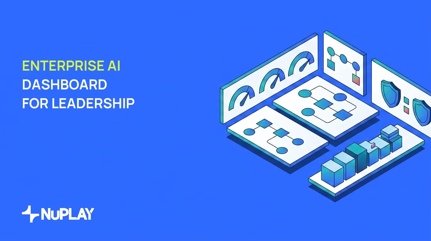

An enterprise AI dashboard should display workflow volume and completion rates across Human, Automated, and Agent modes, outcome metrics like resolution rates and handle time, governance status, and improvement tracking through structured change cycles. This visibility enables leaders to govern AI deployments, measure business impact, and drive ongoing refinements rather than relying on static reports.
Enterprise leaders in retail, insurance, financial services, collections and mortgage, and home services face a common challenge. They need to move beyond usage counts to understand whether AI workflows deliver consistent outcomes and remain under control. Traditional reporting tools fall short because they emphasize historical snapshots instead of forward-looking signals.
The right dashboard surfaces the data required for decisions on scaling, compliance, and investment. It connects daily operations to strategic goals without requiring manual data pulls or separate systems. When leadership can see mode mix, outcomes, ownership, and governed change in one place, the conversation shifts from activity to results.
What is an enterprise AI dashboard?
An enterprise AI dashboard is a monitoring interface that combines natural language queries, predictive analytics, and real-time processing to support decisions about AI-driven workflows. It differs from traditional business intelligence tools by focusing on forward-looking signals rather than static historical views.
These dashboards apply natural language processing, machine learning, predictive analytics, and real-time data processing to deliver instant, context-aware answers. ThoughtSpot's 2026 guide on AI dashboards notes that this approach replaces manual report building with direct exploration of live data.
The shift matters for leaders who oversee high-volume repeatable workflows. Instead of waiting for weekly summaries, they receive anomaly alerts and trend projections that highlight where intervention or expansion will have the greatest effect. A workflow is a set of tasks and decisions that achieve a business outcome. An agent is software that uses a large language model (LLM) to produce an output or decision. Agentic work means moving a task or decision into an agent.
This turns the dashboard into a decision-support layer rather than a rear-view mirror. Leaders can ask plain-language questions about volume by mode, stalled cases, or compliance flags and get answers grounded in current production data. That is the practical distinction from classic BI: exploration and prediction sit beside status, not after it.
Core metrics leadership needs to see
Leadership needs three categories of metrics that together show whether AI workflows are operating at scale and producing value. The first category covers workflow volume and completion rates across Human, Automated, and Agent modes. Tracking these modes reveals how much work has moved into agent execution and where human oversight remains essential.
The second category includes outcome metrics such as resolution rates, handle time, and conversion impact. These figures tie directly to business results in customer service, claims processing, or sales qualification. The third category tracks cost and productivity indicators tied to specific capabilities, such as cost per resolved case or output per team member.
A practical review order helps. Start with volume and completion by mode so you know the mix of work. Then inspect outcomes for the same period so you can see whether agent-mode volume is producing the results you expect. Finish with cost and productivity so investment decisions rest on unit economics, not activity alone.
In retail and home services, leaders often watch contact volume, first-contact resolution, and average handle time by channel. In insurance and mortgage, they watch cycle time, exception rates, and conversion or funding outcomes. In collections and financial services, they watch contact success, promise-to-pay rates, and compliance holds. The labels change by industry. The structure does not: mode mix, outcomes, and cost on the same canvas.
A status, volume, and outcome dashboard surfaces these metrics in one view so leaders can compare performance across modes and time periods. This structure prevents the common problem of isolated point solutions that hide overall workflow health.
Leaders should review these metrics weekly for operational issues and monthly for strategic alignment. The combination of volume, outcomes, and cost data provides the evidence needed to decide whether to expand agent coverage or adjust governance thresholds. If agent-mode share rises while outcomes hold or improve, expansion is easier to defend. If outcomes slip as volume shifts, the next step is diagnosis, not more traffic.
Governance and compliance visibility
Enterprise AI deployments require explicit oversight layers that traditional dashboards rarely provide. An effective view lists every AI system with clear ownership, lifecycle stage, and current status. This inventory prevents shadow deployments and supports audit readiness.
Compliance status must appear against SOC 2 Type 2, ISO 27001, HIPAA, and GDPR requirements. Transparent reasoning paths should show the data sources and logic behind every output so leaders can verify that decisions align with policy. Ownership without lifecycle status is incomplete. Lifecycle status without compliance flags leaves audit teams guessing. Reasoning paths without named data sources make board reporting harder than it needs to be.
Gartner research cited in Ardoq's 2025 analysis of AI governance found that only one in five AI initiatives achieve ROI and just 11 percent of organizations report clear business value, while 84 percent of IT leaders lack a formal process to track AI accuracy or governance. These figures illustrate the visibility gap that a purpose-built dashboard must close.
Leaders use this section to confirm that every workflow meets regulatory standards before scaling. The combination of ownership records, compliance flags, and reasoning traces creates the audit trail required for board-level reporting. In regulated industries such as insurance, mortgage, and financial services, the same view should make it easy to answer who owns a workflow, what stage it is in, which controls apply, and what evidence supports a recent decision path.
A useful governance panel also separates production systems from pilots and retired assets. That separation keeps risk conversations focused on live exposure. It also helps Heads of AI and CTOs prioritize remediation where ownership is missing or lifecycle status is unclear. Governance visibility is not a separate product story. It is the control layer that makes outcome metrics trustworthy.
Improvement and change tracking
An enterprise AI dashboard must surface how workflows evolve after each run. The improvement view displays the Report, Diagnose, Propose, Try, Ship stages with human approve-to-promote gates at each step. This structure shows exactly which friction points were identified and which fixes were validated against historical data.
Coverage metrics indicate whether proposed changes apply to agents, underlying systems, or context layers. Diagnosis details highlight recurring issues such as missing data fields or routing logic that repeatedly routes work to human review. Leaders should be able to see the stage of each open change, who must approve promotion, and whether a trial ran against past production runs before anything reached live traffic.
A strong improvement panel answers four practical questions. What friction was reported from recent runs? What root cause did diagnosis assign? What change was proposed, and to which layer? What was tried, and did a human approve shipment? When those answers sit next to volume and outcome trends, leadership can tell whether the portfolio is adapting under control or drifting through ad hoc edits.
Examples help make the view concrete. A collections workflow may show repeated handoffs when account context is incomplete. Diagnosis points to the context layer. A proposed fix adds the missing fields, a trial replays prior runs, and shipment waits for approve-to-promote sign-off. A claims workflow may show routing that overuses human review for a narrow exception type. The proposed change adjusts routing rules in the systems layer, again with trial evidence and human gatekeeping before promotion.
Leaders review this section to confirm that changes remain governed and that improvements accumulate across the portfolio. The presence of explicit stages and sign-off records demonstrates that the platform maintains control while adapting to new conditions. Improvement tracking is not a vanity feed of model updates. It is a governed change log tied to real workflow friction, coverage of the fix, and evidence from past runs.
ROI and value realization views
Leadership requires direct links between dashboard data and business outcomes. One view shows the percentage of differentiating capabilities now enabled by AI across the application portfolio. Another tracks direct and indirect realization of value through productivity gains and conversion lifts with clear attribution to specific workflows.
These metrics help leaders separate incremental efficiency from strategic advantage. For example, a collections workflow that reduces handle time while maintaining compliance contributes measurable cost savings, while a mortgage qualification workflow that increases conversion rates supports revenue growth. A retail or home-services workflow that lifts contact completion without adding headcount shows capacity value. Attribution matters: leaders need the workflow name, the mode mix, the time window, and the baseline used for comparison.
Direct realization covers outcomes you can tie to a single workflow, such as handle-time reduction, resolution rate, or conversion lift on a defined funnel. Indirect realization covers portfolio effects, such as fewer escalations into adjacent teams or faster cycle time across a multi-step process. Both belong on the dashboard, but they should be labeled so finance and operations do not treat them as the same claim.
The dashboard presents these figures with time-based comparisons so leaders can see whether value realization is accelerating or plateauing. Side-by-side periods, cohort views by launch date, and capability coverage across the portfolio make investment debates concrete. When a capability is marked differentiating, leaders can ask whether AI enablement is present, partial, or absent, and what outcome evidence supports further spend.
Decision guidance follows from the same structure. Expand where attribution is clear and outcomes hold as agent-mode share grows. Pause where value is claimed without a baseline or without mode-level detail. Reallocate where a workflow shows cost improvement but weak conversion or compliance drag. ROI views earn their place when they connect money and capacity to named workflows, not when they present a single portfolio average with no path to action.
Alerting, anomaly detection, and proactive recommendations
Real-time monitoring capabilities reduce the need for constant manual review. Automated flagging identifies threshold breaches and unusual patterns in volume, outcomes, or compliance status. Role-specific intelligent alerts limit notification noise by routing only relevant signals to each leader.
Suggested next actions appear based on detected trends, such as expanding agent coverage in a high-performing workflow or tightening review gates where error rates rise. These recommendations remain tied to the actual data rather than generic rules. A Head of Operations may need volume and completion alerts. A compliance owner may need policy and reasoning-path flags. A CX leader may need resolution and handle-time shifts by channel. One undifferentiated alert stream defeats the purpose.
Effective anomaly detection looks across related signals, not single spikes. A sudden drop in agent-mode completion paired with a rise in human review can indicate routing or context problems. A volume surge with stable outcomes may be load, not failure. A compliance flag without ownership context is harder to triage than the same flag with system name, owner, and lifecycle stage attached. The dashboard should present the pattern, the affected workflow, and the suggested next step in one card whenever possible.
Leaders benefit because they receive early warning of issues that could affect customer experience or regulatory standing. Threshold design should be explicit: what metric, what window, what severity, and who is paged. Quiet hours, digest modes, and escalation paths keep senior attention on material risk. Proactive recommendations work best when they point to a concrete action already supported by the improvement cycle, such as opening a diagnosis, reviewing a pending approve-to-promote item, or inspecting a mode-mix shift against outcomes.
The combination of detection and recommended actions turns the dashboard into an active management tool instead of a passive reporting surface. Review the alert catalog quarterly. Retire noisy rules. Promote rules that repeatedly predicted real operational or governance problems. Alerting quality is part of dashboard quality, not an afterthought bolted onto charts.
Conclusion
An effective enterprise AI dashboard supplies the visibility leaders need to govern AI workflows, measure outcomes, and guide continuous improvement. It replaces fragmented reports with integrated views of performance, compliance, and change.
When mode mix, outcomes, ownership, governed change stages, value attribution, and role-specific alerts sit together, leadership can scale what works and correct what does not without waiting on manual pulls.